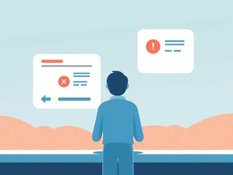
Error Prevention over Error Recovery in UI/UX
Well-crafted error messages play a crucial role in guiding users when mistakes occur, a more effective approach lies in preventing those errors from happening in the first place
While well-crafted error messages play a crucial role in guiding users when mistakes occur, a more effective approach lies in preventing those errors from happening in the first place.

In the realm of user interface (UI) and user experience (UX) design, creating seamless and enjoyable user interactions is paramount. As designers & product managers, we strive to create intuitive and user-friendly interfaces that minimize friction and frustration. Error prevention is a fundamental principle in achieving this goal. This note delves into the concept of "Error Prevention over Error Recovery," exploring its significance, best practices, and real-world examples.
Danish usability guru & author of the famous 1994 article “10 Usability Heuristics for User Interface Design”, Jakob Nielsen says "Even better than good error messages is a careful design which prevents a problem from occurring in the first place."
This proactive approach not only enhances user satisfaction but also reduces support costs. Furthermore, by preventing errors, we shift the burden of flawless interaction from the user to the system, acknowledging that humans are prone to making mistakes and designing interfaces that accommodate these fallibilities. This creates a more user-centered experience where users can explore and interact with confidence, knowing that the system is designed to support them, even when they make mistakes.
Slips vs Mistakes
Before diving into error prevention strategies, it's crucial to understand the different types of errors users commonly make. These can be broadly categorized as:
- Slips: Slips are inadvertent errors that occur when users intend to perform one action but end up performing another. These are often unconscious errors that happen when users are distracted or on "autopilot." For example, a user might mistype a letter in their email address or accidentally click the wrong button.
- Mistakes: Mistakes, on the other hand, are conscious errors that occur when users have incomplete or incorrect information about the task at hand. For example, a user might enter the date in the incorrect order of day & month depending on the region or enter incorrect payment information due to misunderstanding the instructions.
Understanding these different error types allows product teams to implement targeted prevention strategies that address the specific causes of user errors.
Best Practices
Several design strategies can effectively prevent user errors:
- Purposeful actions: For high-stakes actions, make the action more intended & purposeful, such as a swipe action instead of a touch button.
- Confirmations: Alternative to the above, use confirmation for actions with significant consequences, giving users a chance to double-check their action and prevent accidental actions.
- Guardrails: Constrain user input to prevent invalid choices. For example, in a form field for phone numbers, handle regional phone formats in addition to allowing only numerical input.
- Suggestions: Guide users towards correct input by providing suggestions. An elaborate example is PAN handling in India. Some apps auto-switch the keyboard between alphabet & numeric mode depending on the character position the user is currently typing. Autocomplete in search is a simple example.
- Smart Defaults: Pre-select the most common or logical options to minimize user effort and potential errors. For example, in a calendar application, the default event duration could be set to one hour, as this is a common meeting length.
- Follow Conventions: Adhere to established design patterns and conventions to ensure familiarity and predictability for users. For example, use a standard layout for web forms, with labels placed above the input fields, and clearly indicate required fields. This consistency helps users understand how to interact with the interface without having to learn new patterns.
- Make Actions Clear: Use clear and concise language to label buttons and actions, leaving no room for ambiguity. For example, instead of using a generic label like "Submit," use a more specific label like "Create Account" or "Place Order" to clearly indicate the action that will be performed.
- Preview Results: Allow users to preview the outcome of their actions before committing to them. For example, previewing an email before sending it allows users to check for errors in the content or recipient list before it's too late.
- Give Real-time Warnings: Provide immediate feedback when users are about to make an error, such as exceeding character limits in a text field. This allows users to correct the error before submitting the form, preventing frustration and wasted effort.
- Forgiving Formatting: Accept a variety of input formats to accommodate different user preferences and prevent errors caused by strict formatting requirements. For example, a date field could accept various date formats like "MM/DD/YYYY" or "DD/MM/YYYY," allowing users to enter dates in their preferred format without encountering errors.
Examples of Successful Implementations
Many companies have successfully implemented error prevention strategies in their designs:
- Gmail's Attachment Reminder: Gmail alerts users if they mention an attachment in the email body but forget to include it. This prevents the common error of sending emails without the intended attachments.
- Google's Search Suggestions: Google's search bar provides suggestions as users type, preventing typos and leading to more accurate results. This helps users find the information they need more efficiently.
- Mailchimp's Password Requirements: Mailchimp uses real-time feedback to indicate whether a user's new password meets all the criteria. This helps users create strong passwords that meet the security requirements without having to guess or try multiple times.
- Exito's Password Guidance: During signup, Exito's website guides users on creating strong passwords by providing clear instructions and real-time feedback. This helps users create secure passwords and improves the overall security of the platform.
Common Errors and Prevention Strategies
Benefits of Error Prevention
Implementing error prevention strategies leads to several benefits:
- Improved User Satisfaction: By reducing errors and frustration, users have a more positive and enjoyable experience.
- Reduced Support Costs: Fewer errors mean fewer support requests, leading to cost savings for the business.
- Increased Efficiency: Users can complete tasks more quickly and efficiently when they encounter fewer errors.
- Enhanced Brand Loyalty: A seamless and error-free experience fosters trust and loyalty towards the brand.
- Increased User Confidence: When users feel supported by the interface and are less likely to make errors, their confidence in using the system increases, leading to a more positive overall experience.
- More Engaging User Experience: By preventing errors and providing a smooth and intuitive interaction, error prevention contributes to a more engaging user experience that keeps users coming back.
Drawbacks of Error Prevention
While error prevention offers numerous advantages, it's essential to consider potential drawbacks:
- Reduced Flexibility: Overly restrictive error prevention measures can limit user freedom and creativity.
- Increased Development Time: Implementing comprehensive error prevention strategies can require more development effort.
Balancing Error Prevention and Error Recovery
Finding the right balance between error prevention and error recovery is crucial. While preventing errors should be the primary focus, it's impossible to eliminate them entirely. Therefore, a robust error recovery system is still necessary. This includes providing users with the tools and guidance to easily recover from mistakes when they do occur.
Error Recovery Best Practices
When errors do occur, it's essential to provide users with clear and helpful guidance to recover quickly and continue their journey. Here are some best practices for effective error recovery:
- Clear and Concise Error Messages: Provide informative error messages that clearly explain the issue and guide users towards a solution. Use plain language, avoid technical jargon, and offer specific instructions on how to fix the error.
- Intuitive Recovery Paths: Offer clear steps and visual cues to help users recover from errors easily. For example, if a user misses a required field in a form, highlight the field and provide a clear message explaining what needs to be corrected.
Conclusion
Error prevention is a critical aspect of UI/UX design that significantly impacts user satisfaction, efficiency, and overall product success. By implementing the best practices outlined in this report and carefully balancing error prevention with effective error recovery mechanisms, designers can create truly user-centered interfaces that minimize frustration and maximize enjoyment. This approach not only enhances usability but also contributes to achieving broader business objectives by increasing user engagement, reducing support costs, and fostering brand loyalty. By prioritizing error prevention, designers can create intuitive and enjoyable experiences that empower users to interact with confidence and achieve their goals seamlessly.
About the Author:
Swaroop Chand is Chief Business Officer at Niti AI, since September 2024. Based in Bengaluru, India, Swaroop brings over two decades of experience in fintech, software engineering and business growth. A graduate of the National Institute of Technology Karnataka with a B.E. in Metallurgy and Materials Science, Swaroop has held key roles at companies like Citigroup (1999-2005) and Oracle (2005-2016), before starting his own venture Lemonop. As CEO of Lemonop, he scaled a gig economy marketplace to over 850 companies before its acqui-hire by Perfios. At Perfios he led Account Aggregator, Embedded Finance and Wealth Tech Initiatives (2021-2024). Swaroop is passionate about scalable solutions, product strategy, and leveraging technology to transform industries.