Decision Paralysis in UI/UX Navigation
Decision paralysis occurs when users are overwhelmed by too many navigation options. Effective UI/UX uses visual hierarchies, progressive disclosure, and curated choices to reduce cognitive load and improve user experience, preventing frustration and abandonment.
When users encounter an overwhelming number of equally weighted navigation options, they can struggle to make a decision and move forward in their journey.

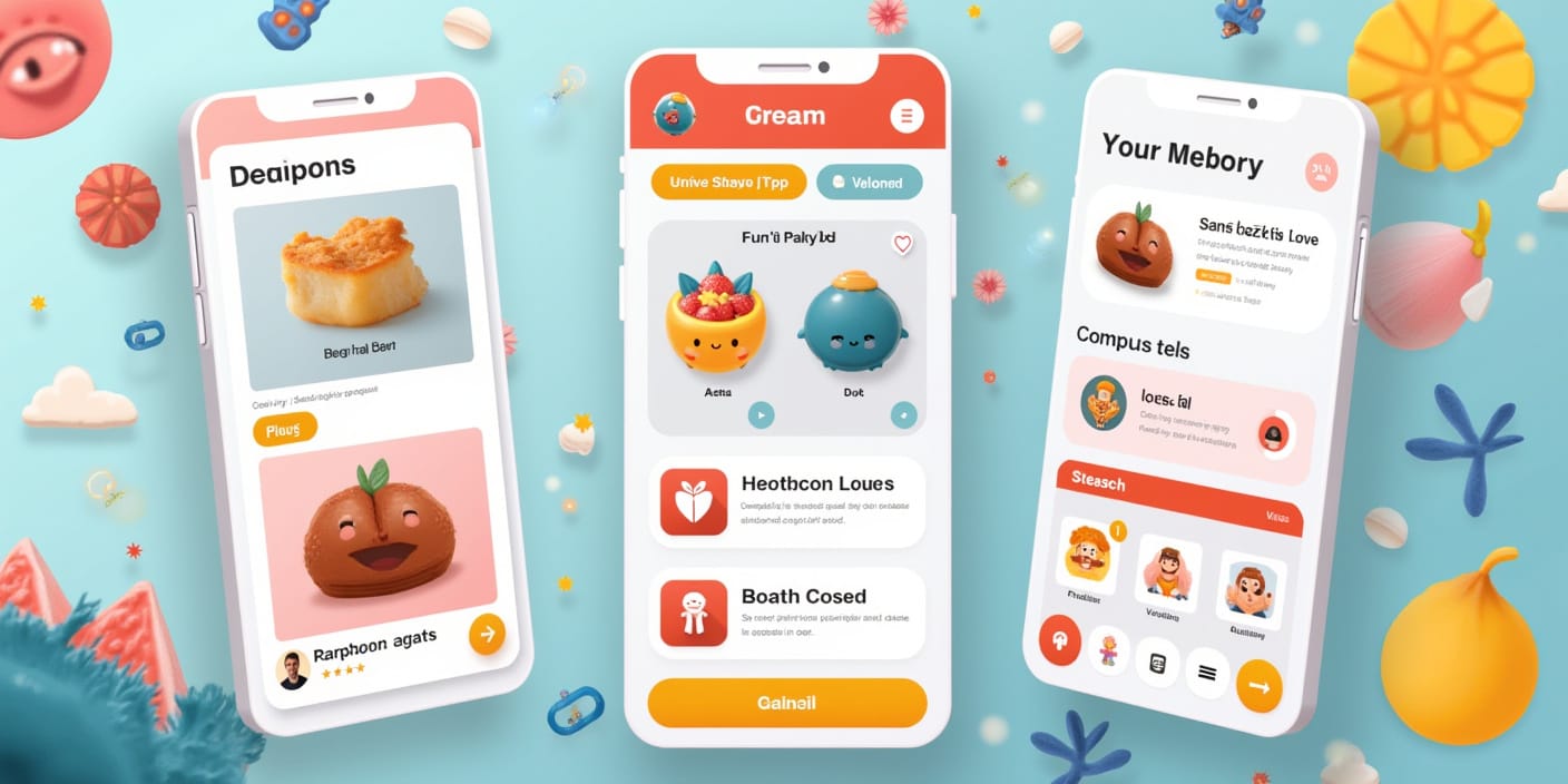
Often, users are presented with too many choices in mobile / web app user interfaces, leading to a sense of overwhelm and an inability to choose. This phenomenon, known as decision paralysis, can lead to frustration, decreased engagement, and ultimately, higher abandonment rates and a negative impact on conversion rates. To avoid this, product managers & user experience designers should consider implementing clear visual hierarchies, cues and progressive disclosure, presenting information strategically instead of showing everything at once.
Hick's Law
Hick's Law, a key principle in UI/UX design, states that the time it takes for a person to make a decision increases with the number and complexity of choices. In the context of navigation, this means that an overwhelming number of options can lead to increased cognitive load and decision-making time, contributing to decision paralysis.
The Paradox of Choice
The paradox of choice, a concept closely related to decision paralysis, suggests that while more options might seem beneficial, they can actually hinder decision-making. Providing too many options can lead to negative outcomes, not just in UX design, but in real-world shopping as well. A study by researchers Sheena Iyengar and Mark Lepper found that consumers were more likely to purchase jam when presented with six flavors compared to 24 flavors. This highlights the importance of carefully curating choices and presenting them in a manageable way.
Curating Choices
Curating offerings is a crucial strategy for reducing cognitive load and preventing decision paralysis. This involves organizing and presenting options in a meaningful way, prioritizing relevant choices, and minimizing unnecessary distractions.
Examples of Decision Paralysis in Different Industries
Decision paralysis can occur in various industries, impacting user experience across different platforms and applications. Here are a few examples:
- E-commerce: A study found that 54% of surveyed consumers said that they stopped purchasing from an online retailer because choosing a product was too difficult. Excessive product options or complex filtering systems can overwhelm users and lead to abandoned shopping carts.
- Healthcare: Complex medical software with poorly designed interfaces can contribute to decision paralysis among healthcare providers. In one instance, nurses with over ten years of experience failed to notice crucial hydration instructions due to a complex charting software interface, leading to a tragic outcome.
- Finance: Financial applications often present users with a multitude of options for accounts, investments, and services. Without clear visual cues and a well-defined information hierarchy, users may struggle to understand their choices and make informed financial decisions. For example, a banking app might use progressive disclosure to guide users through complex processes like loan applications, breaking down the information into manageable steps and preventing overwhelm.
Visual Hierarchies and Progressive Disclosure
To mitigate decision paralysis, UI/UX designers & product managers can employ the following techniques:
Visual Hierarchy
Visual hierarchy involves arranging elements on a screen to guide the user's eye and establish a clear order of importance. Designers can use visual cues like size, color, contrast, alignment, and whitespace to emphasize key elements and create a logical flow. For example, a landing page might use a large, bold headline to capture attention, followed by smaller subheadings and supporting text to guide the user through the content.
Some key principles of visual hierarchy:
- Clear Information Architecture: Visual hierarchy helps establish a clear structure and organization within a design, making it easier for users to navigate and understand the content.
- Guidance and Orientation: Effective visual hierarchy guides users' attention toward the most important elements, such as calls to action, navigation menus, and key content.
- Improved Readability and Scannability: By using visual cues to highlight important information, designers can make content easier to read and scan, allowing users to quickly find what they need.
Progressive Disclosure
Progressive disclosure involves presenting information gradually, revealing more complex features or details as the user interacts with the interface. This helps prevent information overload and allows users to focus on the most relevant information at each stage of their journey.
The Psychology of Decision Paralysis
Decision paralysis is not just a design issue; it's also deeply rooted in human psychology. Cognitive load, the mental effort required to process information, plays a significant role in decision-making. When users are presented with too many choices, their cognitive load increases, leading to feelings of overwhelm and a decreased ability to make decisions. This can also contribute to decision fatigue, a state of mental exhaustion that impairs judgment and leads to poor choices.
Understanding these psychological factors is crucial for minimizing cognitive load and designing interfaces that support efficient decision-making and enhance user satisfaction.
Conclusion
Decision paralysis is a significant challenge in UI/UX design, potentially leading to user frustration and abandonment. By understanding the causes and consequences of decision paralysis, designers & PMs can create more user-friendly interfaces that facilitate informed choices and enhance the overall user experience. Implementing clear visual hierarchies and progressive disclosure are simple strategies for mitigating decision paralysis and guiding users through complex digital environments. The key focus should be on empowering users to make informed decisions and achieve their goals with ease.
About the Author:
Swaroop Chand is Chief Business Officer at Niti AI, since September 2024. Based in Bengaluru, India, Swaroop brings over two decades of experience in fintech, software engineering and business growth. A graduate of the National Institute of Technology Karnataka with a B.E. in Metallurgy and Materials Science, Swaroop has held key roles at companies like Citigroup (1999-2005) and Oracle (2005-2016), before starting his own venture Lemonop. As CEO of Lemonop, he scaled a gig economy marketplace to over 850 companies before its acqui-hire by Perfios. At Perfios he led Account Aggregator, Embedded Finance and Wealth Tech Initiatives (2021-2024). Swaroop is passionate about scalable solutions, product strategy, and leveraging technology to transform industries.