CRAP Principles That Make Design Click
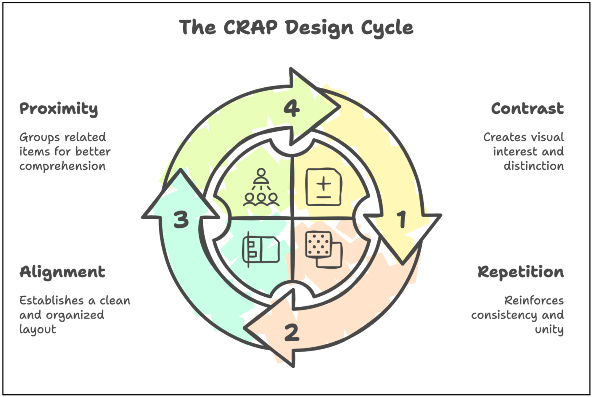
Design Principle: CRAP (Contrast, Repetition, Alignment, Proximity). These principles transform chaotic interfaces into intuitive experiences, guiding users effortlessly.
A Beginner’s Guide to Contrast, Repetition, Alignment, and Proximity
Have you ever scrolled through a website or opened an app and felt instantly at ease? Everything just works—the text is clear, the layout makes sense, and your eyes naturally know where to go next. Now, think about the opposite experience: a cluttered mess of colors, misaligned text, and a navigation system that feels like a maze. The difference between these two? It all boils down to a set of four fundamental design principles that, once you understand them, will forever change how you see the world around you.
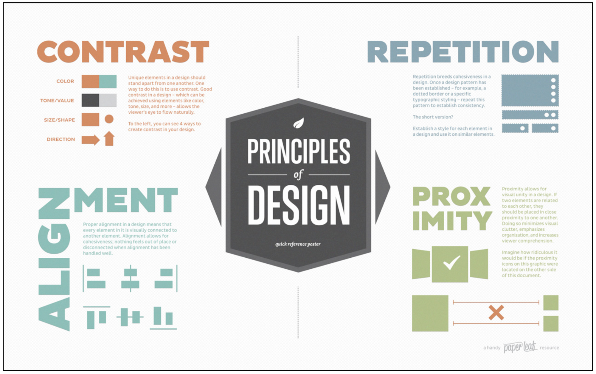
The first time I picked up Robin Williams’ The Non-Designer’s Design Book, it felt like I had unlocked a hidden language—one that explained why some designs feel effortlessly beautiful while others seem chaotic and frustrating. Until then, I had assumed great design was some sort of artistic intuition, something only a select few were born with. But as I turned the pages, I realized that design isn’t just about creativity—it’s about structure, clarity, and purpose. And the secret sauce behind it all? Four simple principles: Contrast, Repetition, Alignment, and Proximity. Or, as Williams cheekily abbreviated them, CRAP.
Once you understand these principles, you’ll start seeing them everywhere—from the sleek interfaces of your favorite apps to the carefully crafted branding of top companies. These concepts are the silent architects of good design, shaping how we absorb information, interact with digital experiences, and navigate the world around us. And the best part? You don’t need to be a professional designer to use them. Whether you're crafting a website, designing a presentation, or just making a flyer, applying CRAP will instantly elevate your work, making it more engaging, intuitive, and visually compelling.
Contrast: The Art of Grabbing Attention
Imagine walking into a bookstore, scanning the shelves for something to read. Your eyes instinctively land on a bold red cover among a sea of neutral tones. That's a contrast at work. It’s the principle that makes certain elements stand out, creating emphasis and visual hierarchy.
In UI/UX design, contrast is crucial. It’s what makes a call-to-action button pop against the background, ensuring users don’t miss it. It’s the reason headlines are bolder and larger than body text, guiding the reader effortlessly through a page. But contrast isn’t just about color—it can be size, shape, weight, or even whitespace.
A well-designed interface doesn’t make you search for important information—it hands it to you on a silver platter. When contrast is used effectively, the user intuitively knows where to look, what to do next, and which information matters most.
Take Spotify’s dark UI, for example. The black background makes the white text and vibrant green play button instantly recognizable. Imagine if everything were the same color—it would be chaos. Contrast brings clarity, making interactions smooth and frustration-free.
Repetition: The Rhythm That Builds Recognition
Repetition is the glue that holds design together. It’s what makes a brand recognizable at a glance—the consistent colors, fonts, and layouts that create a sense of familiarity.
Think about your favorite app. Maybe it's Instagram, where the navigation icons always appear at the bottom, ensuring you don’t have to relearn where things are each time you open it. Or perhaps it's Google, where the minimalist design and familiar font make every product—from Search to Gmail—feel unified.
In UI/UX, repetition plays a key role in creating consistency and user trust. Buttons should look the same throughout an interface, text styles should remain uniform, and interactive elements should behave predictably. Imagine if every page of an app used different button styles or navigation menus—it would be frustrating and confusing.
Repetition isn’t about being boring; it’s about creating a visual rhythm that users instinctively understand. And when done right, it makes interactions feel effortless.
Alignment: Bringing Order to the Chaos
Ever seen a poorly formatted document where text is scattered unevenly across the page? It’s jarring, isn’t it? That’s because our brains crave order. Alignment brings structure and balance, making a design feel intentional rather than haphazard.
In UI/UX, alignment isn’t just about making things look pretty—it’s about guiding the user’s eye naturally across the screen. Every button, text block, and image should have a clear relationship with other elements. Whether it’s left-aligned text for readability or a perfectly centered call-to-action button, alignment helps users navigate with ease.
Take Apple’s website as an example. Every product image, headline, and button aligns beautifully, creating a sense of harmony. Even though there’s a lot of information, it never feels overwhelming because alignment keeps everything neat and digestible.
A good rule of thumb? Nothing should ever feel random in design. If an element looks out of place, it probably is.
Proximity: The Silent Guide to Relationships
Ever glanced at a restaurant menu and felt overwhelmed because everything was crammed together? That’s what happens when proximity is ignored.
Proximity is about grouping related elements together so users can understand their relationship at a glance. Imagine filling out an online form where the labels are far from the input fields—frustrating, right? When elements are placed close together, users instinctively understand that they belong to the same category.
In digital design, proximity helps create logical groupings. A product’s price should be near its name. A navigation bar should keep related links together. Whitespace plays a big role here too—giving elements breathing room makes them easier to process.
Look at Amazon’s product pages. The "Buy Now" button isn’t floating randomly on the page; it’s strategically placed next to the product image and description. Everything you need is visually connected, reducing friction in the user experience.
When elements are too far apart, users struggle to make connections. When they’re too close, things feel cluttered. Finding the right balance is what makes great design feel effortless.
Bringing It All Together
The beauty of the CRAP principles is that they aren’t just about making things look good—they’re about making things work well. They transform digital experiences from confusing to intuitive, ensuring that users don’t have to think twice about how to navigate an interface.
The next time you visit a website or open an app, take a closer look. Notice how contrast directs your attention, how repetition makes interactions feel familiar, how alignment brings order, and how proximity groups related content.
And if you’re designing something yourself, start small. Experiment with making important elements stand out more (contrast), ensuring buttons and links stay consistent (repetition), aligning elements for clarity (alignment), and grouping related content together (proximity).
As you embark on your design journey, remember that CRAP principles are your compass. They won't just help you create visually appealing interfaces; they'll help you communicate more effectively, create more intuitive experiences, and ultimately, connect more meaningfully with your audience. Design is conversation. And with contrast, repetition, alignment, and proximity as your vocabulary, you're ready to start a fascinating dialogue.
About the Author
Kratika Nyati is an emerging talent in product design, currently pursuing a Bachelor’s degree in Design and Visual Communications at the National Institute of Fashion Technology (NIFT) in Bengaluru, India, with an expected graduation in May 2025. Based in Bengaluru, India, she specializes in product design, UX/UI design, and creative design thinking, with proficiency in Adobe Creative Suite and Figma. Kratika has gained hands-on experience through internships at Niti AI, Whatfix, OnFinance AI, and others, focusing on user-centered design, mobile interfaces, and usability testing. Passionate about interaction design and branding, she combines technical skills with a creative approach to craft impactful digital experiences.